

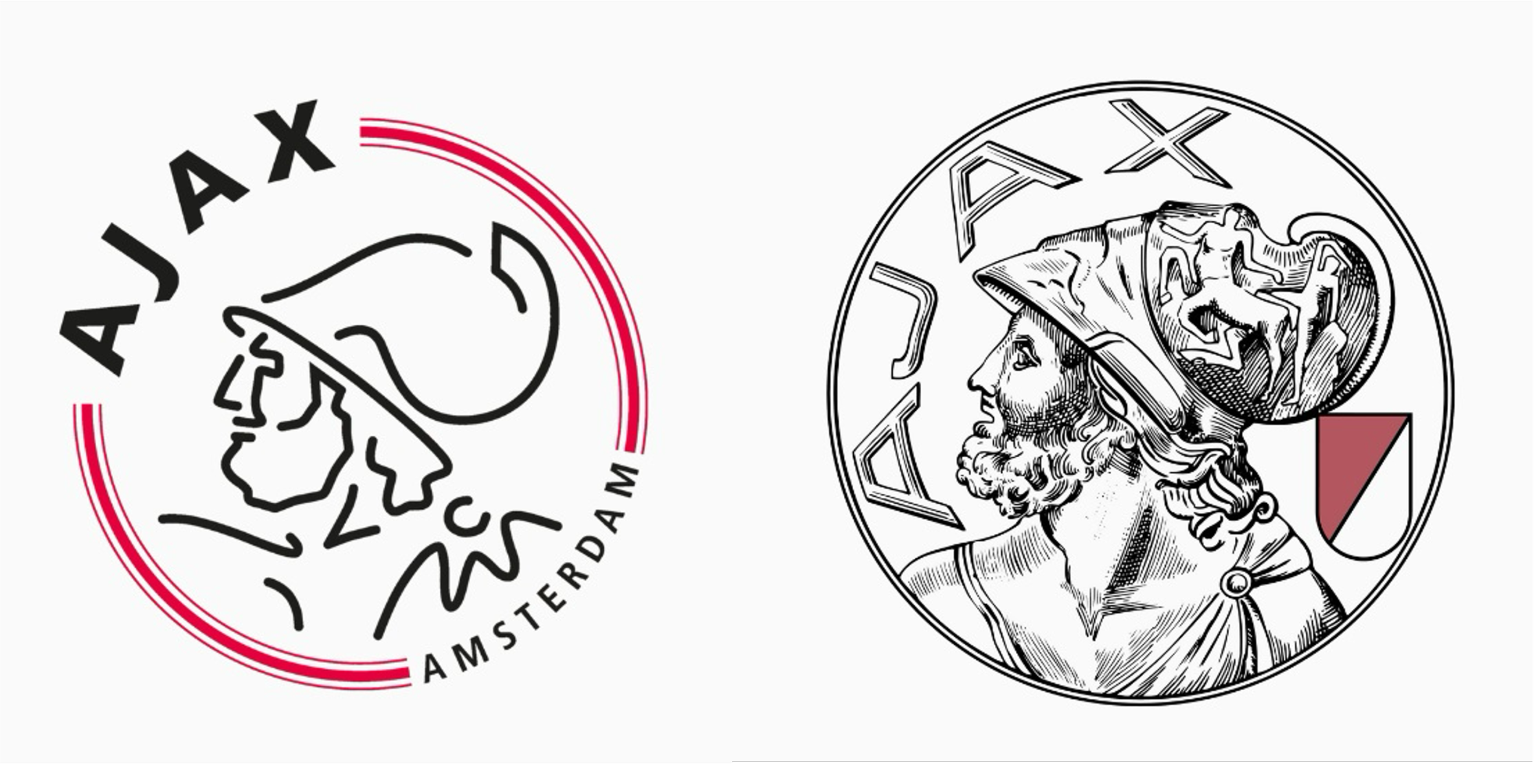
In a bold move that has grabbed attention across sports and marketing, Ajax FC has announced it will be returning to its classic logo starting in the 2025-26 season. The emblem, first introduced in 1928 and used until 1990, features a more detailed and traditional design, including the head of the Greek hero Ajax. The decision to reinstate this vintage logo, following a more minimalist redesign in 1990, begs the question: Is this a sign of the end of ‘blanding’ in sport marketing?
‘Blanding’ is a term used to describe the homogenisation of brand identities through minimalist design elements. Blanding is not just a trend; it’s a strategic approach driven by the idea that simplicity is more versatile and globally recognisable.
Karen Maxwell of Fluxbranding explains that blanding in branding typically involves characteristics such as sans-serif fonts, clean lines, geometric shapes, a limited colour palette, and the overall simplification of logos.
While this minimalist aesthetic is appealing in its ease and recognisability, it often sacrifices personality and uniqueness. In the world of sports, where passion, history, and identity are deeply rooted, such simplification can feel like a dilution of the club’s heritage and its connection to fans. One of the most notable outcomes of Ajax’s decision has been the overwhelmingly positive fan response. Supporters have expressed excitement and nostalgia for the club’s more detailed, classic design.
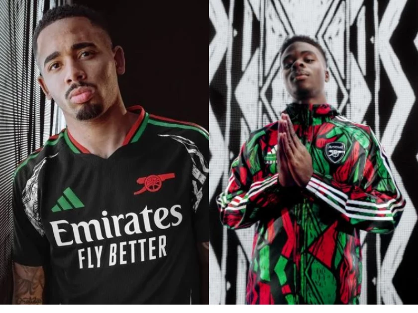
Other football clubs have also embraced heritage and fan culture in their branding strategies. Arsenal, for example, collaborated with Adidas and Labrum on their 2024-25 away kit. The kit, along with Labrum’s collection, features bright Pan-African colours that are far from bland, celebrating Arsenal’s fanbase from the African diaspora in London and around the world. Vogue Business hailed Arsenal as “fashion’s favourite club” when reflecting on how the club has become synonymous with fashion.
Luxury fashion brands are also rethinking blanding. In February 2023, Burberry unveiled a new logo by the current creative director Daniel Lee. The logo features a serif typeface, marking a return to the brand’s heritage. It includes the equestrian knight motif and a more subtle serif font, paying homage to Burberry’s long-standing British identity and their original logo from 1901. This revamped logo contrasts with the simple, sans-serif logo introduced in 2018 under Riccardo Tisci.

Diana Pearl of The Business of Fashion sees this shift is part of a broader trend, with other luxury brands like Bottega Veneta and Salvatore Ferragamo also adopting serif fonts. This suggests a potential reversal of the “blanding” trend that favoured minimalist, unembellished logos.
We may be witnessing a turning point in the evolution of marketing and branding. Ajax, Arsenal, and Burberry’s decisions to embrace their roots seem to signal a shift away from sterile minimalism and towards a renewed emphasis on authenticity.
What these brands are demonstrating is that authenticity, heritage, and emotional connection are powerful tools in branding. Consumers want more than just a sleek design; they want a logo that honours heritage—whether from a luxury brand or a football team. This could signal a move away from sterile minimalism, as brands seek to recapture the unique, passionate identities that make them stand out. Even in a world where the strategy of “less is more” has reigned supreme for so long.

Leave a comment